The Geometry of Culture, Recreated
Rebuilding the word2vec model and the class, gender, and morality dimensions from Kozlowski, Taddy and Evans (2019), checking them against survey data, and putting words in an interactive 3D space.
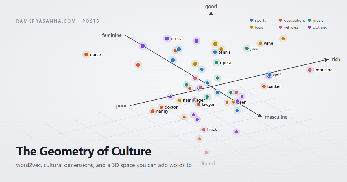
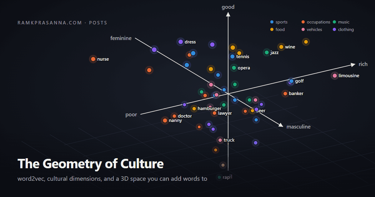
A recreation of The Geometry of Culture: Analyzing the Meanings of Class through Word Embeddings (Kozlowski, Taddy and Evans, American Sociological Review, 2019). The charts are computed from scratch in Python. The 3D space at the end is live: type a word and see where it lands.
In short: a word2vec model trained on 52 billion words of Google Books text places words on class, gender and morality lines built from antonym pairs; those positions agree with what 398 survey respondents said (r = .40 class, .71 gender on our model; .58 and .88 on Google News); and you can drop your own words into the space below.
The idea
Words have an incredible amount of meaning behind them. Beyond the literal definition of a word, one could do the thought experiment of where a specific word lay on various dimensions. Let's take golf for example. Golf is an outdoor sport where players try to hit a ball into various holes in the fewest hits possible. Beyond this definition, golf also has subtext underlying it. Ranking this on a scale of rich to poor, I would say golf is more rich. I could do this on various dimensions such as gender, education, or morality. Kozlowski, Taddy and Evans claim in The Geometry of Culture that a word embedding trained on a large body of text contains these meanings behind words as directions in space, and that a word's position along such a direction matches what people say in surveys.
This post rebuilds that result. I train a word2vec model on the paper's corpus, construct the cultural dimensions the same way the authors do, check them against the authors' survey data, and put class, gender and morality on the axes of a 3D plot you can add words to.
How word2vec learns meaning
Word2vec never sees a definition. It learns from which words appear near which other words. Slide a window over the text. At each position there is a center word and a few context words on either side:
In the skip-gram version used in the paper, the model is given the center word and has to predict each context word. Every word in the vocabulary gets a vector of 300 numbers, and the model scores a (center, context) pair by the dot product of the two vectors. Training nudges the vectors so that pairs that actually occur score high, and a few randomly drawn pairs score low (this is negative sampling; the paper uses 8 random words per real pair). That is the whole model: one layer of weights, trained with stochastic gradient descent.
The vectors are the weights. Two words that keep appearing in the same surroundings must predict the same contexts, so they end up with similar vectors.
The Google Ngrams model
The paper's corpus is the Google Books Ngram corpus: for every sequence of one to five words, how many times it was printed in each year, computed from the books Google has scanned. The authors trained a skip-gram model (300 dimensions, window of 5, 8 negative samples) on the 5-grams dated 2000 to 2012, and released it. I loaded that model: 928,250 words.
Where the text comes from
Since the space is built from this text and how the words are used together, the source of the text matters. The meaning and space derived from the model is the representation of how the authors thought of the word itself. Therefore it is important to understand where, when, and who used these words.
- Books, not speech or news. The 2012 edition of the corpus was extracted from 4.5 million English-language volumes, about 468 billion words, drawn from the more than 15 million books Google had digitized through its partnerships with university libraries and publishers. Google describes the full collection as more than 6% of all books ever published. The American English subset is books published in the United States. Serials and books with poor OCR or uncertain dates were dropped, and a 5-gram is only included if it appears in at least 40 books.
- Written by people who got published. Novels, textbooks, government documents, academic monographs and technical reports, by authors, editors and institutions that had access to a press. The paper is explicit that this is not a sample of Americans; it calls the population of inference the "literary public" and warns that poor and marginalized groups rarely have their discourse published in books.
- Dated 2000 to 2009. The files are labelled by year of publication. Although the model is described as 2000 to 2012, the 2012 edition of the raw data ends in 2009, and the volume of text roughly doubles over the decade, so the later years weigh more:
- Increasingly technical. Pechenick, Danforth and Dodds (2015) showed that the share of scientific and medical writing in Google Books rises steeply through the twentieth century, and that the corpus counts each book once, like a library shelf, with no weighting by how widely anything was read. A prolific technical author counts for as much as a bestseller. This is the likely reason the authors found race associations so weak in this corpus (and strong in news text): much of the 2000s book text is non-narrative, and "white" appears far more often as a color or a technical term than as a racial category.
So the space below is the geometry of published, mostly non-fiction, American English prose from the 2000s. It agrees well with what people surveyed in 2016 and 2017 said about class and gender, which is the paper's point, but it is one voice among many.
Training our own
I also trained a model on the same data with the authors' training script. The US English 5-gram set is 711 files and 155 GB compressed. I streamed all of it, kept the rows dated 2000 to 2009, and repeated each 5-gram by its count. That left 3.4 billion distinct 5-gram rows (52 billion words as seen by the model). Filtering took 95 minutes with 12 processes; one training epoch took 9 hours on a 16-core desktop. The result has a 391,000-word vocabulary.
from gensim.models import Word2Vec

# each item is one 5-gram as a list of lowercase tokens, repeated by its count
model = Word2Vec(ngrams_2000_2012, sg=1, vector_size=300, window=5,
                 negative=8, min_count=10, epochs=3, workers=16)
wv = model.wv
The word2vec model is said to understand the relative meaning behind words. The famous test is the analogy. Take the vector for king, subtract man, add woman, and look for the closest word:
It works because the model stores relations as directions. The arrow from man to woman is nearly the same arrow as from king to queen, from he to she, from actor to actress. In the authors' model the result lands on queen with cosine 0.71; in my own model it lands on queen with cosine 0.63. That arrow is a gender direction. The paper's contribution is to build such directions on purpose, and to treat them as cultural dimensions.
Building a cultural dimension
- Pick antonym pairs that span the opposition. For class the paper lists 42, taken from five thesauri: rich and poor, affluent and destitute, luxurious and threadbare, and so on.
- For each pair, normalize the two vectors and subtract. rich minus poor is a direction in the 300-dimensional space.
- Average those differences and normalize. The average is the class dimension (the paper calls it affluence). What is specific to one pair (rich and poor also carry "money"; luxurious and threadbare carry "fabric") washes out; what they share stays.
- To place a word, take the cosine between its vector and the dimension. Positive means rich, negative means poor, near zero means the word does not carry that connotation.
import numpy as np

def nrm(v):
    return v / np.linalg.norm(v)

def make_dim(wv, pairs):
    diffs = [nrm(nrm(wv[a]) - nrm(wv[b])) for a, b in pairs]
    return nrm(np.mean(diffs, axis=0))

affluence = make_dim(wv, [("rich", "poor"), ("affluent", "destitute"), ...])
project = lambda word, dim: float(nrm(wv[word]) @ dim)
project("golf", affluence), project("welfare", affluence)   # 0.14, -0.21
Here is that recipe drawn with the real vectors. Every antonym pair is an arrow; the dimension is their average; a word's score is its shadow on that average:
I rebuilt all eight dimensions in the paper's appendix: class (affluence in the paper), gender, race, morality, cultivation, employment (owner versus worker), education and status. One check that a dimension means what you intend is to look at the common words at each end:
Google News model, 20,000 most common words.
The rich end of class is luxurious, sumptuous, posh; the poor end is destitute, homeless, unemployed. Morality separates respectful, principled from nefarious, fraudulent. The white end of race is full of creamy, crisp, cheeses: the color sense of "white" leaks in, which the paper notes as a limitation. A dimension is only as good as its antonym list.
Checking against people
The paper asked 398 Americans on Mechanical Turk to rate 59 words (sports, jobs, music genres, foods, vehicles, clothing, first names) on 0 to 100 scales for class, gender and race, then correlated those ratings with the embedding projections. The authors published the survey means, so the same test can be run on every model here:
On the authors' Ngrams model I get class .51, gender .73, race .28 (the paper reports .53, .76 and .27). On Google News, the other pretrained model the paper tested, I get .58, .88 and .74, matching the paper's .58, .88 and .75. My own model, trained on the same corpus for one epoch, reaches .40, .71 and .08 (57 words; two survey words never cleared the 10-occurrence floor). Gender matches the authors' model almost exactly. Class is lower, which is what capping the repeat counts and stopping after one pass costs: class associations live in the long tail of phrases, and the authors' run saw them many more times. Race is near zero here and .28 for the authors, both far below news text, for the reasons above. Gender is the easy case because English marks it constantly; class is harder; race barely registers in lowercased book text.
Each point is one survey word: what people said on the x axis, what the model says on the y axis. The dropdowns switch dimension and model.
The paper's Figure 3 places music genres on race and class, as rated by people and by the Google News model. Same plot, my run, both z-scored across the 59 words:
Opera is high class and white in both. Rap and hip hop are working class and Black in both. Jazz is Black and high class in both. The two disagree on magnitude, rarely on direction.
The same words on a gender by class plane, by category:
Sports match the paper's Figure 2: boxing poor and masculine, golf and tennis rich, softball and volleyball feminine. Names split cleanly by gender, and Connor and Molly sit above Jamal, Tyrone, Shanice and Aaliyah on class. None of this was labelled. It is how the words are used.
How the dimensions relate
The dimensions live in the same space, so we can measure the angle between them. A cosine near zero means two oppositions are independent.
Education and class go together (.36 in the Ngrams model, .38 in Google News), and both are tied to cultivation. Employment runs slightly against morality: the owner end carries a faintly negative moral charge relative to the worker end, which the paper also reports. Gender is close to orthogonal to everything, and affluence barely correlates with gender or morality. That matters for the next section: class, gender and morality are nearly independent axes, so drawing them as x, y and z is a fair picture.
Class, gender and morality in 3D
Affluence on x, gender on y, morality on z, with the poles labelled at the ends of each axis (they stay on the correct side as you rotate). The survey words are the landmarks, colored by category; click a category to hide or show it, double-click to show only that one. Drag to rotate, scroll to zoom, hover for values. Type a word and it is added as a labelled diamond. Below the plot, every added word gets three gauges, one per axis, with the needle at its position on a −100 to 100 scale (±100 is the 99th percentile of the vocabulary); a whole category gets gauges when it is the only one showing. The lookup uses the Google News model (38,000 most common words and proper nouns), since it has the largest vocabulary and validates best against the survey; any axis can be swapped for race, cultivation, employment, education or status.
Caveats. The model describes text and potentially the authors, not the world: a word projecting poor is a word that is written about alongside poverty. Words with several senses get one vector ("suit", "black", "pitch"). The axes depend on the antonym lists, though the paper shows results are stable past about ten pairs. And the corpus has a date: books to 2012, news to about 2013. The same method on today's text would move some of these words, and measuring that movement is what the paper goes on to do across the twentieth century.
Reproducing this
- Paper: Kozlowski, A. C., Taddy, M. and Evans, J. A. (2019). The Geometry of Culture: Analyzing the Meanings of Class through Word Embeddings. American Sociological Review, 84(5), 905 to 949.
- Authors' code, antonym lists, survey data and pretrained Ngrams model: github.com/KnowledgeLab/GeometryofCulture
- Raw 5-grams: Google Books Ngrams v2, eng-us-all. Google News vectors via
gensim.downloader(word2vec-google-news-300). - Python (gensim 4.4, NumPy, pandas), charts in Plotly. The 3D widget ships a precomputed table of projections and does lookups in the browser.