How my apps do Liquid Glass and the iPhone Duo
The design language behind the latest updates to Flip 7 Score Tracker, BG Health Tracker, Question Wizard, Extreme Pool Arena and Best to Worst. Tokens, glass, motion and the Duo layout rules, with the code.
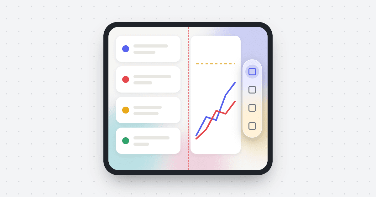
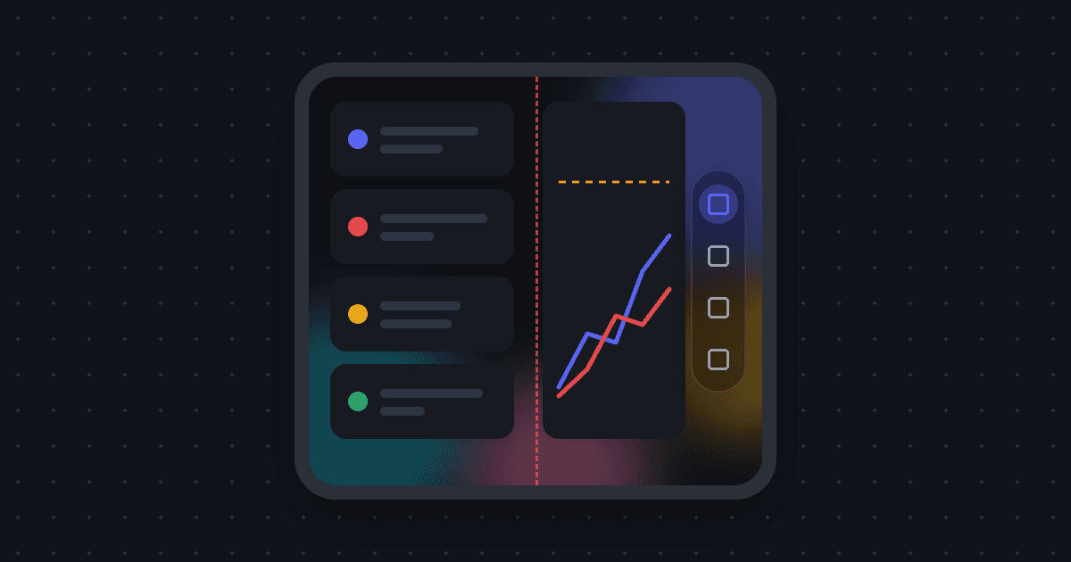
A reference for how my five iOS apps look and adapt. Flip 7 Score Tracker is the reference implementation; BG Health Tracker, Question Wizard, Extreme Pool Arena and Best to Worst follow it, with the differences noted below. All are React Native on Expo. Copy this to build a sixth.
The rules
- Glass is chrome, not content. Tab bars, toolbars, floating buttons, segmented controls and overlays on charts are glass. Cards, list rows and text stay on opaque surfaces so they read.
- Never glass on glass.
- Capsules and concentric corners. Inner radius is outer radius minus padding. Chrome floats, inset from the edges, never a full-bleed bar.
- One accent. Indigo, used only for the primary action and the selected item.
- Springs without bounce for chrome. Content fades in 120 to 200 ms.
- Width decides the layout, not the device. The Duo's two screens, the iPad and a phone in landscape all go through the same rule.
- Respect Reduce Motion and Reduce Transparency.
Tokens
One palette, the same keys in light and dark. It lives in src/theme.ts in Flip 7.
| Token | Light | Dark | Use |
|---|---|---|---|
| bg | #F6F6F4 | #0F1115 | Screen |
| surface | #FFFFFF | #171A21 | Cards |
| surfaceAlt | #EFEFEC | #20242D | Chips, wells |
| border | #E7E7E2 | #272C36 | Hairlines, gridlines |
| ink | #1A1C20 | #F2F3F5 | Text |
| inkSoft | #70757E | #9AA1AD | Secondary text |
| inkFaint | #A8ADB5 | #5C6370 | Hints |
| accent | #5661F0 | #6B76FF | Primary, selection |
| accentSoft | #EDEFFE | #232745 | Selected fill |
| success | #2FA36B | #3DBC7F | Gains |
| danger | #E5484D | #F0565C | Losses, destructive |
| gold | #E8A818 | #F2B33D | Wins, targets |
| glassFallback | rgba(255,255,255,0.55) | rgba(18,20,26,0.6) | Glass where real glass isn't available |
| overlay | rgba(10,12,16,0.55) | rgba(0,0,0,0.65) | Modal scrims |
Series colors, in this order, the same on phone, watch and web:
export const PLAYER_COLORS = [
  "#5661F0", "#E5484D", "#E8A818", "#2FA36B",
  "#9A5CE5", "#E06C9F", "#14A3B8", "#F07C2E",
];
export const playerColor = (i: number) => PLAYER_COLORS[i % PLAYER_COLORS.length];
Shape and depth:
export const radius = { sm: 10, md: 14, lg: 20, xl: 28 };
// Card: shadow #15171B, opacity 0.06, radius 12, y 4, elevation 2
// Sheet: shadow #000, opacity 0.3, radius 24, y 10
export const TAB_CLEARANCE = 96; // room for the floating tab bar under scroll content
Type is the system font. Question Wizard is the one app with a type object, and it's the scale the others use inline:
| Style | Size | Weight | Tracking |
|---|---|---|---|
| Screen title | 28 | 800 | −0.6 |
| Row title | 17 | 700 | −0.2 |
| Body | 15 | 600 | |
| Caption | 12 | 600 | |
| Section label | 11 | 700, uppercase | 1.1 |
Numbers use fontVariant: ["tabular-nums"]. Screen padding is 20. Content caps at 760 wide.
Glass
Packages (Expo 54): expo-glass-effect ~0.1.10, expo-blur ~15.0.8,
react-native-bottom-tabs ^1.4.0 with @bottom-tabs/react-navigation, and
react-native-screens ^4.19.0 for native header items. Extreme Pool Arena is on Expo 58 with the
matching expo-glass-effect ~58.0.4.
One wrapper
Every glass surface goes through one component. Real glass on iOS 26 and later, a blur plus a translucent fill everywhere else.
import { GlassView, GlassContainer, isLiquidGlassAvailable } from "expo-glass-effect";
import { BlurView } from "expo-blur";

export const liquidGlass = Platform.OS === "ios" && isLiquidGlassAvailable();

export function Glass({ variant = "regular", interactive, tint, style, children }) {
  const c = useColors();
  if (liquidGlass) {
    return (
      <GlassView
        glassEffectStyle={variant}
        isInteractive={interactive}
        tintColor={tint}
        style={[style, { borderCurve: "continuous" }]}
      >
        {children}
      </GlassView>
    );
  }
  return (
    <View style={[style, { borderWidth: StyleSheet.hairlineWidth, borderColor: c.border, overflow: "hidden" }]}>
      <BlurView
        intensity={40}
        tint={c.glassTint}
        style={[StyleSheet.absoluteFill, { backgroundColor: c.glassFallback }]}
      />
      {children}
    </View>
  );
}

// Glass pieces that sit together merge and morph as one.
export const GlassGroup = liquidGlass
  ? (p) => <GlassContainer spacing={12} {...p} />
: View;variant="clear"over imagery and charts.regularbehind text, like a leaderboard pill or a toast.- Only the selected or primary item gets a tint, the accent at about 20% (
${accent}33). - Reduce Transparency (Question Wizard does this, and it should be everywhere): listen with
AccessibilityInfo.isReduceTransparencyEnabled()and thereduceTransparencyChangedevent, and render a solidsurfaceinstead of glass.
Native chrome first
The tab bar is the system's, so it's real Liquid Glass and minimizes on scroll:
<Tab.Navigator
  tabBarActiveTintColor={c.accent}
  hapticFeedbackEnabled
  minimizeBehavior="onScrollDown"
>
  <Tab.Screen
    name="Games"
    options={{ tabBarIcon: ({ focused }) => ({ sfSymbol: focused ? "trophy.fill" : "trophy" }) }}
  />
</Tab.Navigator>
Headers are transparent so content runs under them, with native glass buttons:
export const floatingHeader = {
  headerTransparent: true,
  headerTitle: "",
  headerShadowVisible: false,
  headerTintColor: c.ink,
  contentStyle: { backgroundColor: c.bg },
};

navigation.setOptions({
  unstable_headerRightItems: () => [
    {
      type: "button",
      label: "Share",
      icon: { type: "sfSymbol", name: "square.and.arrow.up" },
      variant: prominent ? "prominent" : "plain",
      tintColor: c.accent,
      onPress,
    },
  ],
});
Screens pad themselves with useSafeAreaInsets() and leave room under the scroll content for the
floating tab bar (TAB_CLEARANCE + insets.bottom).
Light and dark
Flip 7 has its own theme switch and pins the system to it with Appearance.setColorScheme(scheme),
so native glass matches the app. The others follow the system and pass colorScheme to
GlassView. BG Health Tracker is always dark, on pure black.
Behind the glass
Glass needs something behind it to look like glass. Each app has a quiet backdrop:
- Flip 7: four soft radial blobs (accent, teal, pink, gold) at 26% alpha in light, 38% in dark.
- BG Health Tracker: slow falling icons on black.
- Question Wizard: falling colored question marks.
- Best to Worst: falling "best / okay / mid / ehh / worst" on the menus, rising and sinking chevrons in a game.
All are native-driver loops and stand still under Reduce Motion.
On the web
Flip 7's web build draws its own floating capsule: a 60-intensity blur, radius 30, a hairline border and the sheet shadow, with 76 × 52 tabs. Extreme Pool Arena's web glass is plain CSS:
backdrop-filter: blur(12px) saturate(160%);
box-shadow: 0 16px 40px rgba(0, 0, 0, 0.5);       /* dark */
box-shadow: 0 12px 30px rgba(21, 23, 27, 0.16);   /* light */
Motion
Every tappable thing is a PressableScale: it shrinks to 0.96 on press and springs back, with a
selection haptic. Submits and milestones get a medium impact.
// Reanimated
scale.value = withSpring(0.96, { damping: 22, stiffness: 500 }); // press in
scale.value = withSpring(1, { damping: 18, stiffness: 400 });    // release
Haptics.selectionAsync();| Motion | Spring or timing |
|---|---|
| Press in / out | damping 22, stiffness 500 / damping 18, stiffness 400 |
| Segmented pill | damping 24, stiffness 260, mass 0.8 |
| Tab pill glide (no bounce) | damping 32, stiffness 300, mass 1, overshootClamping: true |
| Layout changes | LinearTransition.springify().damping(27).stiffness(230).mass(0.9), clamped |
| Content mount | 180 ms, translateY 10 → 0, scale 0.96 → 1 |
| Drag to reorder (Best to Worst) | damping 24, stiffness 260, mass 0.7; a lifted row scales to 1.035 |
Under Reduce Motion (useReducedMotion()), mounts start at rest and count-ups, chart draw-ins
and confetti are skipped.
iPhone Duo
The Duo has an outer screen and a larger inner one that folds down the vertical middle. In points:
| Screen | Upright | Sideways |
|---|---|---|
| Outer | 466 × 678 | 678 × 466 |
| Inner | 669 × 951 | 951 × 669 |
One layout hook
Everything reads one hook. It decides single or split layout, where the tab bar is, and where the hinge falls.
export const REGULAR_MIN_WIDTH = 640;
export const REGULAR_MIN_HEIGHT = 600;
const FOLD_MAX_WIDTH = 1100;

export function useLayout() {
  const { width, height } = useWindowDimensions();
  const insets = useSafeAreaInsets();

  const regular = width >= REGULAR_MIN_WIDTH && height >= REGULAR_MIN_HEIGHT;
  // On the Duo, the status pill and tab bar move to the side; the insets say so.
  const sideChrome = insets.left + insets.right >= 60;
  const tabBar =
    Platform.OS === "ios" && Platform.isPad && regular ? "top" : sideChrome ? "side" : "bottom";

  const topBarInset = tabBar === "top" ? 56 : 0;
  const bottomClearance = tabBar === "bottom" ? TAB_CLEARANCE + insets.bottom : 24;

  // Inner screen sideways: split at the hinge. iPads are wider than 1100 and don't fold.
  const foldSplit = regular && width > height && width < FOLD_MAX_WIDTH;
  // The hinge is the middle of the screen, not of the content area.
  const toHinge = (padding: number, gap: number) =>
    Math.floor(width / 2 - insets.left - padding - gap / 2);

  return { regular, tabBar, topBarInset, bottomClearance, foldSplit, toHinge };
}
What the apps do with it:
- Split at the hinge. The left pane ends exactly at the fold. Nothing straddles it. Question Wizard keeps a 28-point gutter clear down the middle, since React Native has no API for the hinge region.
- Grids stay even. BG Health Tracker's game grid is two columns sideways, the left column ends on the hinge, and an odd last tile stays left of the fold.
- Upright inner screen can stay one column. Best to Worst only splits when sideways or at 760+ wide. One tall list read better there.
- Hide what doesn't fit. Flip 7 drops the sparkline on the outer screen below 400 points of usable width.
The tab bar moves to the side
On the Duo, when a screen is sideways or the outer screen is upright, iOS moves the status pill and the system tab bar to the right edge. It only does that for apps built with the iOS 27.1 SDK or later. Flip 7 1.4.0, built with Xcode 27.0, kept a bottom bar. 1.5.0, built with Xcode 27.2, got the side bar with no code change. Build with a current release Xcode.
Extreme Pool Arena draws its own tabs, so it has its own rail: icon-only slots 48 points tall in a 56-point rail, placed inside the status column, when the screen is at least 700 × 500 and wider than tall.
Config
supportsTablet: trueandorientation: "default"inapp.json. Extreme Pool Arena is the exception: portrait only, withUIRequiresFullScreen.- Every React Native
<Modal>passes all orientations. Without it, iOS forces portrait when a modal opens.
export const ALL_ORIENTATIONS = ["portrait", "landscape-left", "landscape-right"];
<Modal supportedOrientations={ALL_ORIENTATIONS} />- The iOS 27 SDK wants the scene lifecycle. A small config plugin adds it.
Testing
- Xcode 27.2's DeviceHub runs an "iPhone Duo" simulator on iOS 27.1. Fold and rotate there.
- Screenshot each screen:
xcrun simctl io <udid> screenshot --display=primaryfor the outer and--display=primary-1for the inner. - Flip 7 has a Playwright script that renders the web build at all four Duo sizes with a dashed red line at the hinge, so anything crossing the fold is obvious.
- App Store screenshots for the Duo are the inner screen sideways, 2853 × 2007, and need fastlane 2.241 or later.
Gotchas
- Glass goes blank under a fading parent. UIKit stops drawing a visual effect while any
ancestor has alpha below 1, so
entering={FadeIn}left my glass toasts empty. Animate transform, not opacity, on anything that contains glass. - The side tab bar needs the new SDK (above).
- A native back button that didn't respond. On my real device, Question Wizard's iOS back button did nothing, though it worked in every simulator. 1.3.0 hides the native header and draws its own glass Back button.
- Debug builds hide missing native modules. BG Health Tracker crashed at launch in release
with "Cannot find native module ExpoFontLoader".
@expo/vector-iconsneedsexpo-fontas a direct dependency. - Bouncy pills look cheap. Extreme Pool Arena's tab pill at damping 18 overshot. Critically
damped with
overshootClampingfixed it. - Text inside glass chips can clip descenders. Set an explicit
lineHeight.
The five apps
| App | Version | Notes |
|---|---|---|
| Flip 7 Score Tracker | 1.6.0 | The reference. Native tabs and header items, a watch app, and a web build |
| BG Health Tracker | 1.1.0 | Two screens, always dark on black, clear-glass setup cards by choice |
| Question Wizard | 1.3.0 | Own glass header and Back, honors Reduce Transparency |
| Extreme Pool Arena | 0.68.2 | A game: portrait only, custom glass and tab rail, Expo 58 |
| Best to Worst | 1.0.0 | Built on Question Wizard's glass, theme and layout |
The watch app doesn't use glass yet. It's plain capsules in the accent color and the same eight series colors, with a haptic on every tap.
Checklist for a new app
- Copy the theme, the
Glasswrapper,PressableScaleanduseLayout. - Use the system tab bar and native header items where the app has them.
- Cards opaque, chrome glass, one accent.
supportsTablet, all orientations, andsupportedOrientationson every modal.- Build with the newest release Xcode.
- Check the outer and inner screens, upright and sideways, plus light, dark, Reduce Motion and Reduce Transparency.